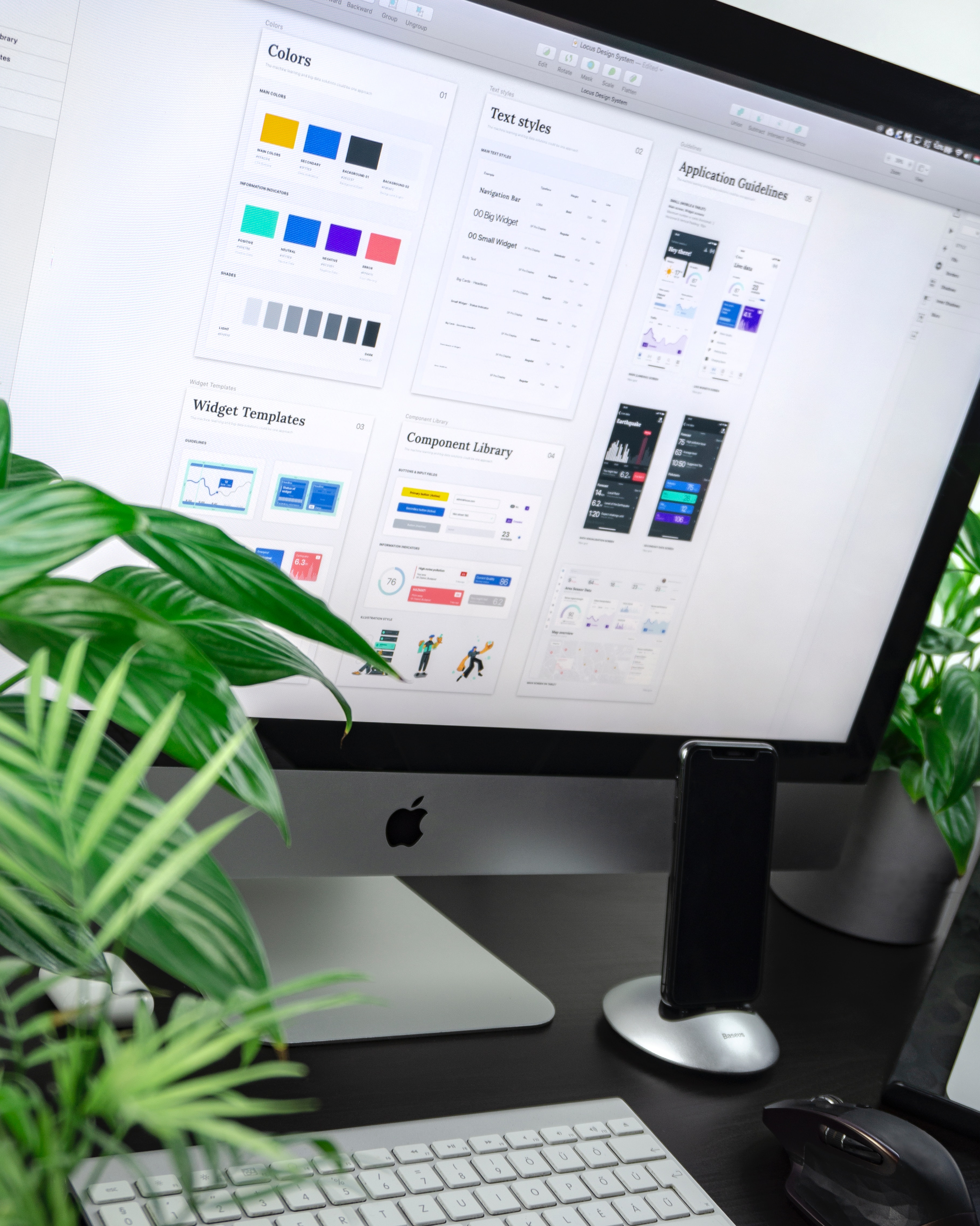
Overview

The Problem

The Problem

Scholarly is an edtech startup with over 20 Apps on playstore, after joining the team, I reviewed the structure of the projects and found many similar elements, such as colors, fonts, and layouts. Developers were sometimes using a color picker to get the attributes from designs, which led to inconsistent results.

Scholarly is an edtech startup with over 20 Apps on playstore, after joining the team, I reviewed the structure of the projects and found many similar elements, such as colors, fonts, and layouts. Developers were sometimes using a color picker to get the attributes from designs, which led to inconsistent results.

Goal

Goal

Create a design system with standard guidelines for colors, fonts, layouts, and other elements. This will ensure that our products remains consistent and scalable as the company grows.

Create a design system with standard guidelines for colors, fonts, layouts, and other elements. This will ensure that our products remains consistent and scalable as the company grows.

Considerations

Considerations

I built the entire system from the ground up, taking into account the brand guidelines and the client's preferences. The system was designed and documented in a way that made it easy for developers and other designers to understand.

Color Style

Color Style

Colour Styles

I used shades of the brand's primary and secondary colors to create a color palette that reflects its identity.

I used shades of the brand's primary and secondary colors to create a color palette that reflects its identity.

Primary Colour

Primary Colour

#E7F7E9

Green

50

#B6E6BA

Green

100

#92DA98

Green

200

#60C96A

Green

300

#41BF4D

Green

400

#12AF20

Green

500

#109F1D

Green

600

#0D7C17

Green

700

#0A6012

Green

800

#084A0D

Green

900

Secondary Colour

Secondary Colour

#fef8e8

Orange

50

#fad57c

Orange

100

#f8c343

Orange

200

#f7b71d

Orange

300

#ad8014

Orange

400

Grey Scale

Grey Scale

#EBEBEB

Grey

50

#C1C1C1

Grey

100

#A3A3A3

Grey

200

#7A7A7A

Grey

300

#606060

Grey

400

#383838

Grey

500

#333333

Grey

600

#282828

Grey

700

#1F1F1F

Grey

800

#141414

Grey

900

Subject colours

Subject colours

#707BFF

Maths

#F380F5

Physics

#64ACEF

Government

#6E7BEA

Literature

#F150A3

Accounting

#6491D3

Commerce

#1F99BC

CRS

#DF8D49

Economics

#7D9D38

IRS

#53DDC4

S. studies

#337EED

F. Maths

#D357D6

Geography

#D09234

History

#74A1DF

Agricultural science

#52AC91

Integrated Science

#949E56

Computer

#EA6DBF

Home Economics

#FFC700

PHE

#FF5A5A

Igbo Language

#58CF88

Yoruba Languange

#FF68B1

French Language

#F39560

Arabic Language

#6B90EE

English Language

#6A82FF

Hausa Language

#4CD4F4

Chemistry

State colours

#FF5259

Success

#51C46B

Error

Text Styles

Text Styles

I created a typescale based on display headings, utility headings, paragraph styles, and supporting styles.

I created a typescale based on display headings, utility headings, paragraph styles, and supporting styles.

I created a typescale based on display headings, utility headings, paragraph styles, and supporting styles.

Mulish

Display Headings

Desktop

Weight: Extra-Bold > Black; size - 64px; Line: Auto

The quick brown fox jumps over the lazy dog.

Desktop

Weight: Extra-Bold > Black; size - 48px; Line: Auto

Weight: Extra-Bold > Black; size - 48px; Line: Auto

The quick brown fox jumps over the lazy dog.

Desktop

Weight: Semi-Bold > Extra-Bold > Black; size - 64px; Line: 84px; Letter; -1

The quick brown fox jumps over the lazy dog.

Desktop

Mobile

Weight: Semi-Bold > Extra-Bold; size - 36px; Line: Auto

Weight: Semi-Bold > Extra-Bold; size - 36px; Line: Auto

The quick brown fox jumps over the lazy dog.

Desktop

Mobile

App

Weight: Semi-Bold > Extra-Bold; size - 24px; Line: Auto

Weight: Semi-Bold > Extra-Bold; size - 24px; Line: Auto

The quick brown fox jumps over the lazy dog.

Body

Heading

(Website)

Desktop

Mobile

App

Weight: Regular > Semi-Bold; size - 18px; Line: 120%

Weight: Regular > Semi-Bold; size - 18px; Line: 120%

The quick brown fox jumps over the lazy dog.

Desktop

Mobile

App

Weight: Regular > Semi-Bold; size - 16px; Line: 120%

Weight: Regular > Semi-Bold; size - 16px; Line: 120%

The quick brown fox jumps over the lazy dog.

Desktop

Mobile

App

Weight: Semi-Bold; size - 14px; Line: 140%

Weight: Semi-Bold; size - 14px; Line: 140%

The quick brown fox jumps over the lazy dog.

Desktop

Mobile

App

Weight: Semi-Bold; size - 12px; Line: 140%

Weight: Semi-Bold; size - 12px; Line: 140%

The quick brown fox jumps over the lazy dog.

Icons

I chose to use a simple icons set like Hero Icons because complex icons can be overwhelming for users. I wanted to make sure that users could easily understand what each icon represented.

Subject Icons

I created unique icons for the different subjects. These icons have unique subject colors as well

I created unique icons for the different subjects. These icons have unique subject colors as well

Buttons

For the buttons, I made them simple and in different states; active, hover, focus, and disabled states. The buttons are 100% responsive and scalable.

Form Fields

Like the buttons, I designed different variants and states for the form fields to give the developers an insight on how each state or variant should look.

Other Components

In addition to icons, other components of Design System include modals, dropdowns, and menus. These components are reusable and responsive, which ensures design consistency and speed.

Design systems are living documents that evolve as products and users do.

"A Design system is a living document that is constantly evolving. As your product or service grows and changes, so too will your design system. New components will be added, existing components will be updated, and the overall structure of the system will be refined. This is because a design system is not just a collection of components; it is also a set of principles and guidelines that govern how those components are used. As your understanding of your users and your product evolves, so too will your design system."

"A Design system is a living document that is constantly evolving. As your product or service grows and changes, so too will your design system. New components will be added, existing components will be updated, and the overall structure of the system will be refined. This is because a design system is not just a collection of components; it is also a set of principles and guidelines that govern how those components are used. As your understanding of your users and your product evolves, so too will your design system."